The LiveEngage platform is the industry leader for conversation management at scale.
User Focus
Used by the largest call centers in the world, agents, managers and analysts can act and inspect on consumer interactions in real time. To design for so many personas, I spent a lot of time with the users in call centers, to learn first hand how to simplify each step of their routines.
Roles
As head of product design, I was responsible for driving product concept, creative direction, creating the design system, UX, and user research. I took a hands-on approach to creating the UI elements, directing the team on user research, and using the design system to create widgets and function screens.
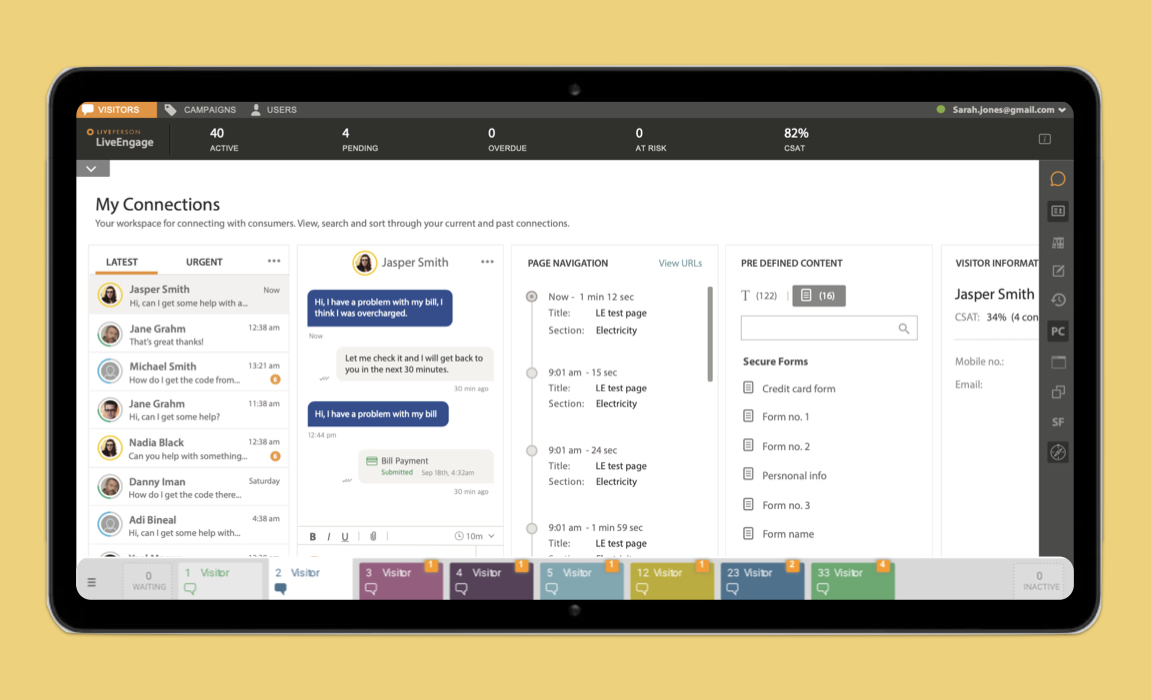
User Focus: Agents
For agents the UI must be super simplified, prioritizing conversations and creating hierarchy on the queue. Second: access to extra information to support interactions do via widgets, such as: user history, product info, and Commonly used answers.
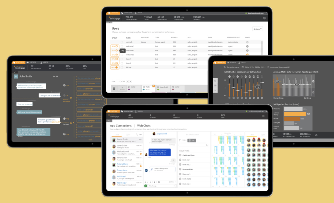
User Focus: Call Center Managers
Managers need to access to real time performance and sentiment data, and have the ability to “jump in" to help overloaded agents. Managing and inspecting general agent load over time.
User Focus: Program Directors
Their main need is access to real time data, such as performance data, hot topics, and conversion rates. With that the ability to visualize and generate reports, which were presented in beautiful graphics.
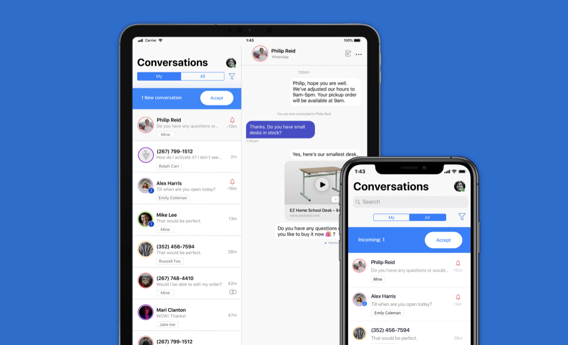
User Focus
Immediately upon release users showed great interest in taking the conversations to their physical stores, so creating a mobile version of the LiveEngage messenger was the natural move. To make a light version of the system I chose to focus on conversations only, with widgets and reports accessible under a menu.
Roles
My role here was to direct the design team to use the design system we created, combined with iOS best practices. And at a second stage conduct user research first hand at the brick-and-mortar stores.
The Conversational website is a unique patent-awarded interface model. On which the center of the UI is a conversation with the AI, which drives the supporting visual content presented on the larger area.
User Focus
The core concept is Instead of making the user search and learn how to use a website, we start a conversation and simultaneously present suggested content. As the user interacts, the content is molded around them.
Roles
I created the whole concept, UI design, product specifications, UX, and development direction. I also formatted the project to be ready for patent application, and registered the patent with the IP attorney teams.
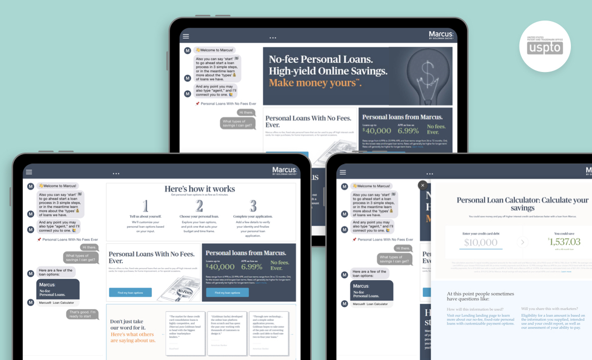
For Goldman Sachs specifically, the user focus is on longer term interactions, such as loans and investments. So I chose a conversation flow that allowed quick access to forms and calculators, which could be accessed again in future sessions, by referring to your conversation history.
The versatile model of the conversational website is built as a platform to feature the client’s brand identity and graphics, while maintaining the core functionality.
User Focus
For this iteration for BuddyBank, the conversation design was centered around selling and comparing new credit card options, since user research showed this was the main topic of site visits and questions.
Roles
The conversational website projects had a very consultive aspect, so my role was to connect with the client and their business needs, and bring that into the conversation design flow. As well as applying the client branding and graphics to the interface.
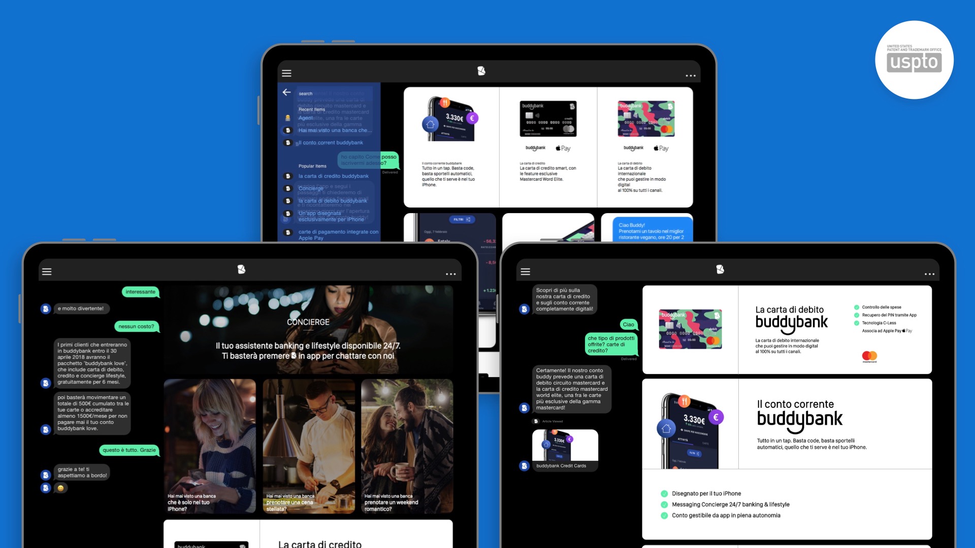
Mobile version
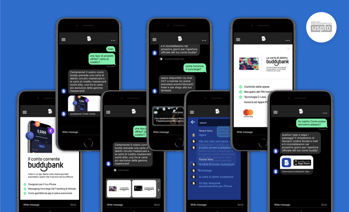
The mobile version of the content-adaptive Conversational website works flawlessly in a smaller screen, taking advantage of new interface elements such as “suggested topics" and “content guide" that overlay on the conversation screen.
User Focus
I took advantage of how much users are already familiar with messaging in general, so I created an enhanced version of it to be able to bring complex elements into the experience.
Roles
I was responsible for the interface design, and conversation design, while working with the dev team to accommodate limitations of browser-based messaging with the new elements and responsiveness.
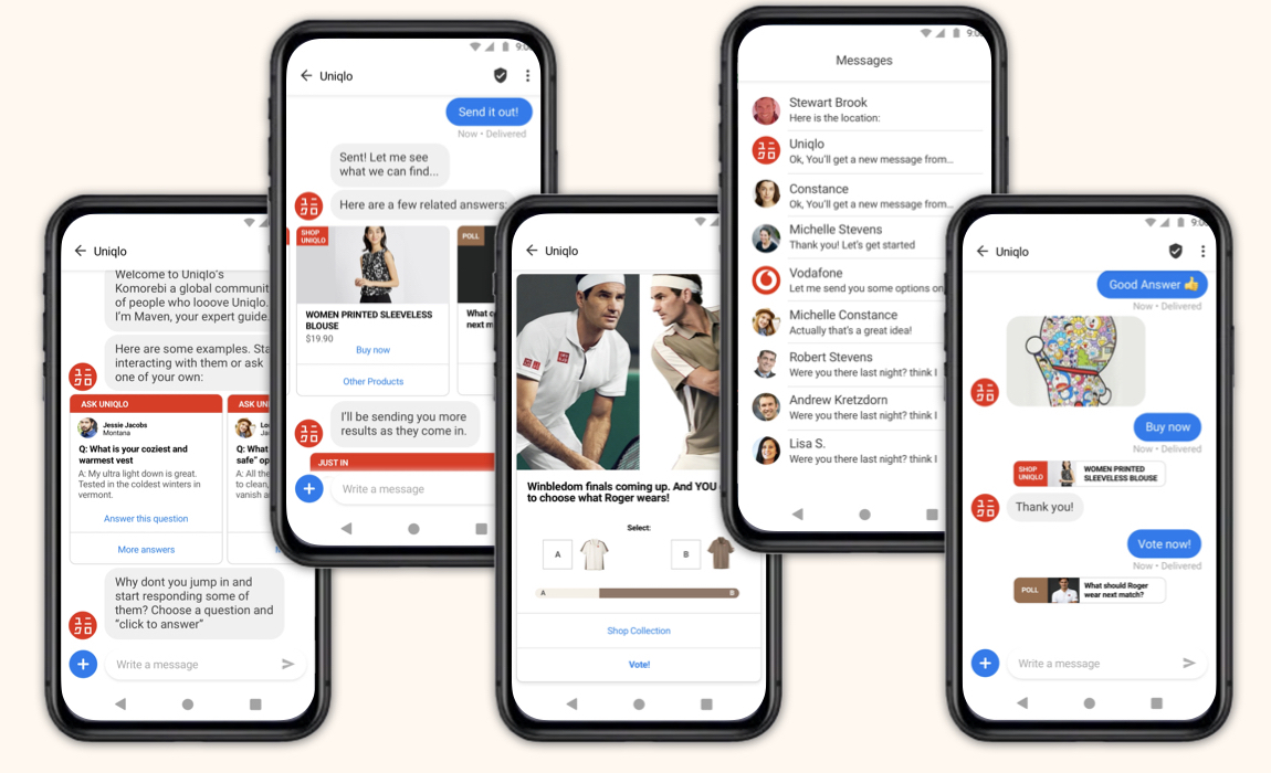
Taking advantage of the new Google RCS and Apple Business Chat technologies, we developed an automated conversation platform called Maven, using new interactive widgets – calling these projects “App-less" Apps.
User Focus
For the Uniqlo user, I identified that they seek innovation and don’t want to be “pushed" product and promotions. So I chose to bring fresh new possibilities to conversational commerce, such as polls, exclusive product catalogs, mini-games and Q&A’s.
Roles
To create the program that would be scalable to multiple clients, I’ve designed the widgets, UI, and basic conversation flow, that would be easily customizable. To be in consistent direct interaction with the dev team was essential.
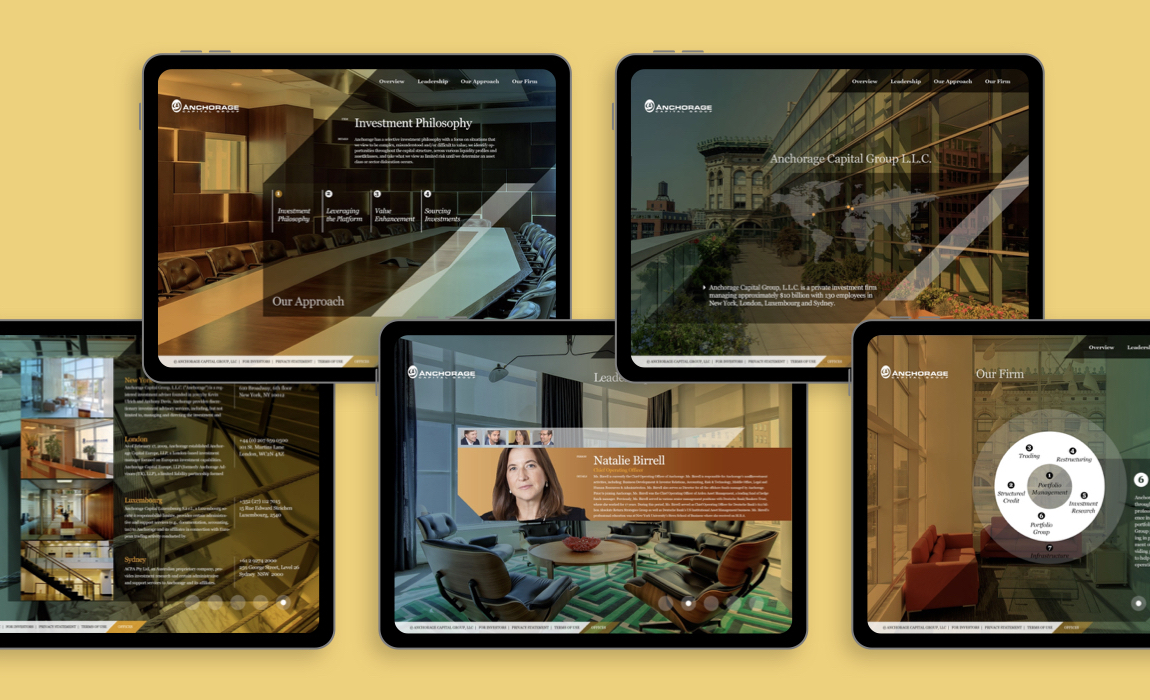
To reflect exclusivity and and the high-end nature of this business, I created a website intended to perform as a corporate deck and mini-app.
User Focus
There were 2 main user groups: Employees that would use this as an interactive deck, for them we made the interactions clear or happening on auto-play. For clients, who would access the website on their own, I focused on bringing more detailed information about the fund and partners, with easy navigation and discoverability.
Roles
I first structured the content, created information flow, and designed the UX design. After some initial tests, I formatted the digital design, and directed photography work.
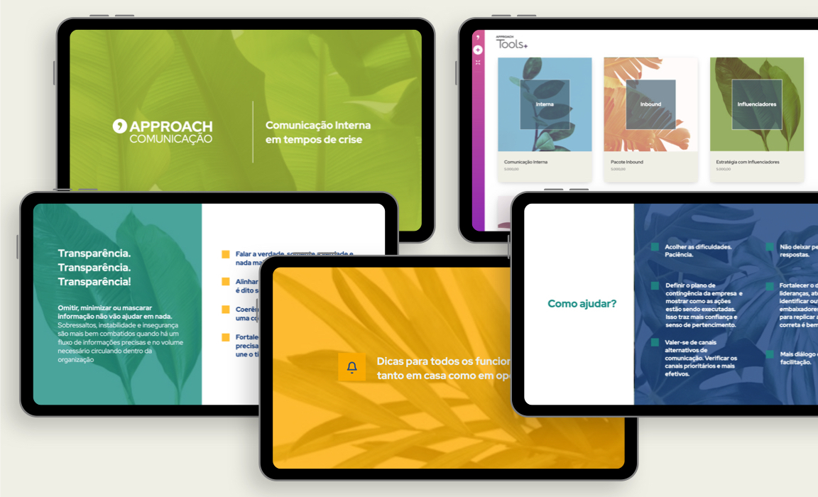
Approach is a full spectrum communications agency, and focused expanding their digital footprint and client tools.
User Focus
In order to make it as easy as possible for the use to hire and engage with a PR team. Creating product packages and courses easily accessible via e-commerce, and an engagement flow that allowed for project management via messaging.
Roles
I was responsible for product, product design, technology strategy and directing the dev implementation team.
User Focus
On this multi-faceted project, there were 2 main users. For patients I chose to keep the interactions as simple and playful as possible, while gamifying the progress. For doctors I brought a higher level of detailed functions, which can be easily accessed by expanding panels.
Roles
I was responsible for Product Design, UX, User research, as well as Branding, Packaging and Product Marketing tools. While directing illustrators and animators to create the avatars to support the user guide interface, and also used in branding.

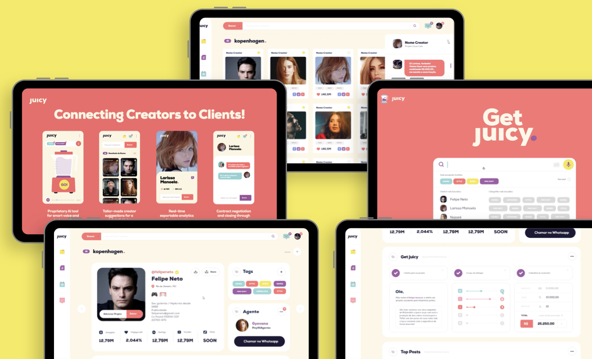
Juicy is a platform for small businesses and agencies to hire influencers and content creators to promote their brands. The goal is to facilitate access and structure to searching and hiring influencers.
User Focus
The user needs an easy way to search, hire, and manage creators. The current way users define their needs is through a briefing, so instead of using a simple keyword search, I created a large copy/paste area for a complex text, and presented results in visual cards. Management was done in a modified subscription purchase flow, which users are accustomed to.
Roles
I was the team lead in product, responsible for project management, UX, directing the design team on UI work, and driving the execution of dev team.
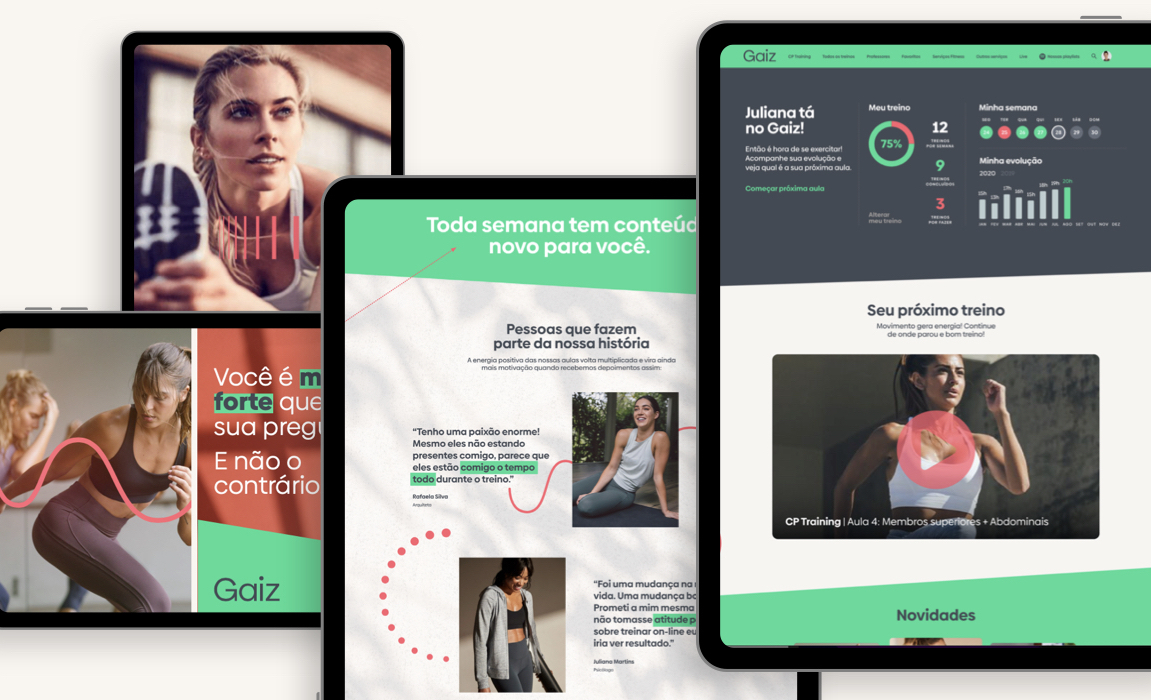
Gaiz is an online fitness platform, where users can follow a weekly video training program, customize their schedules and log their workouts.
User Focus
I took advantage of the familiarity users have with video subscription services, and online courses. Making the interactions and instructions video-first. while focusing on mobile version to facilitate the user experience at the gym, where they usually bring their phones.
Roles
I led product, customer experience, UX and product marketing. I directed the choice of technology platforms used, while leading the dev team on integration and maintenance.
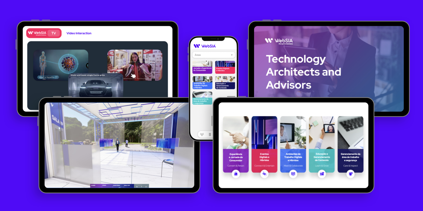
At WebSIA my goal was to reorganize the product offers, and create a digital marketplace for digital products and services.
User Focus
To simplify the user experience in searching a large product catalog, I chose to group them in 5 large areas, and used a an interactive video interface to navigate products. I also created a marketplace app with product offers, news, recent features and customer support.
Roles
I first focused on branding and product marketing, then led the product team on the marketplace app, and supported strategic sales.
The goal was to create a simplified solution for a real estate portal, which connects 3 parent companies, multiple listing sources and agents.
User Focus
There were 2 mais user groups: The clients – for which I chose a simple visual unified search that aggregated results from all 3 sources. The management company – for whom content maintenance and editing should be simple and fast.
Roles
I was responsible for product and technology strategy, integrating platforms, product design, UX, and branding.
