For the branding of the world’s leader in messaging software company, we used a primitive sun symbol, as well as a bright orange representing wisdom.


To bring warmness we used a rounded friendly type and sober colors applied on the branding, packaging, product and the digital presence.

This group of brands were created to work harmoniously under the new identity of this communications agency.

For this health supplement brand, we created a sober identity combining custom illustrations and clean type.

For this hotel and restaurant we developed a sophisticated identity reflecting the colors and tastes of Brazil.

We wanted this brand to be rustic, timeless and reference the greek olives.

Once we created this custom illustration for the logo for a major coffee export brand, it was applied on the large jute bags of coffee, and quickly helped make the brand know as the “parrot coffee” throughout the world.

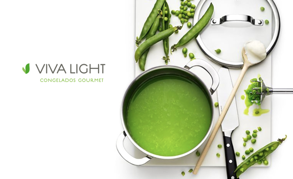
For the brand symbol we created a logo with leaf or bean pod forming a “V” combined with with warm minimalistic type. Applied in all food packaging, uniforms, signage, menus and website.

For this unique vegan culinary brand, we used custom script, bold colors and retro imagery, for a chic classical look.

This gallery features renowned Brazilian photographers. So for this identity the design had to be as minimal as possible and yet recognizable.

Reflecting the era of this interior design exhibit, we’ve brought classic Swiss typography and minimal art direction for the photography.

Redesigning the identity of this classic nautical brand, we introduced the seagull symbol and refreshed their iconic typography.

For this art show brand identity project, we’ve combined minimalistic typography with impactful colors.

We’ve shot a beachwear collection completely underwater, achieving a whimsical ambience for this iconic brand.

For this branding project we created custom typography, and with it we built a series of fun characters using type elements. We used them on the web presence, packaging and signage.
