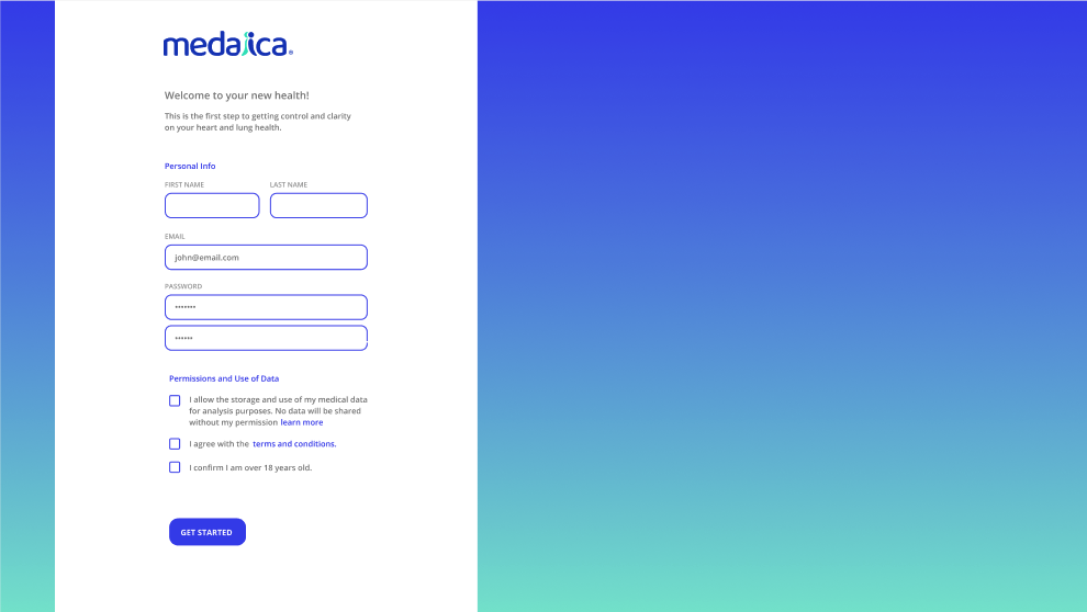

We sketched thinking of the patient-user first, since it’s a direct-to-consumer product. And imagining the details of the interactions right on the screen.


We quickly referred to zoom/video calls – “What would we need to add to this to make a successful exam?"

Adding details on the screen allowed us to cross out information that was not totally essential to the current step, allowing for simplicity.

Once the initial UX is ready, we defined the tools necessary for the Doctors to proceed with the exam.


Details on the “Starting an Exam"


Once all the features as listed and sketched out, a precise UX document is generated, where we annotate all the steps and variations, done in tandem with UI solutions and look and feel.


Building a prototype that is mostly consumer ready, is almost parallel to building the actual product. Testing directly with doctors in mock and real sessions, gathering feedback directly into the UX file.


Iterations of interactive device positioning guide.


