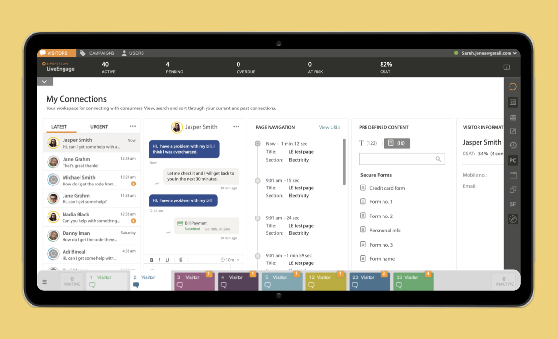
We spent hours at a time in the call centers, and asked the question “What would it be like if it was easy?"

In a great brainstorming week with the head of Product, RnD, Managers and especially Agents, we whiteboarded the main components of our interface.


We added the main building blocks, and areas of highest interactivity. And quickly brought it to a prototype, with animation and scale, so we could interact with the concept.

Once we brought it to pixel, it became clear the process was now much simpler and pleasurable. We split the multiple interface parts in groups, and assigned UX/UI team leads.

Outline of the main conversation panel.

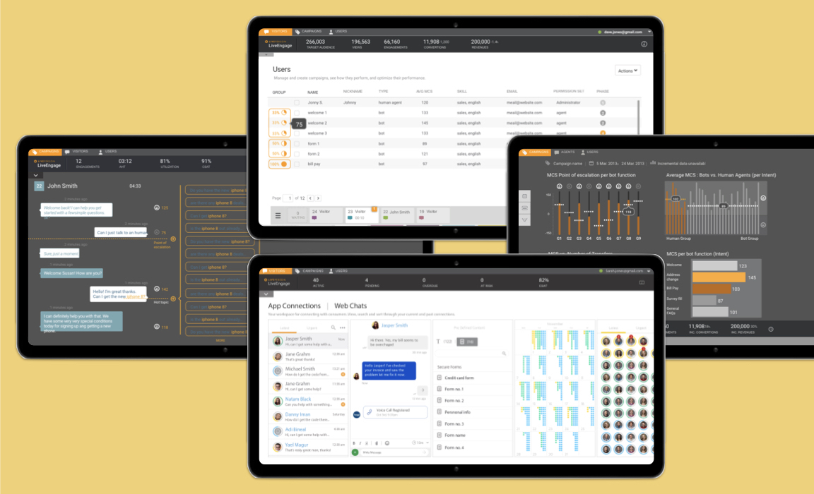
Once the main areas are mapped, we introduced the relationships among them, and mapped out flows and processes to guide the construction of the platform.

Overview of flows and areas.


The overview of campaigns is the main touchpoint on the interface. Where you can access all the interactions.

Each detail of the UI had to be tested thoroughly for compatibility and QA. Each area of the interface was dedicated to a Team with UX and UI specialists running individually.


While the initial concepts are finalized, prototyping and building are constant, and multiple versions of the UI are generated and tested on mobile and desktop devices.


Recorded sessions were done remotely and on location, and user feedback is passed directly into specifications and layouts.
Testing it directly with agents, and recording feedback to Development and Product teams, constantly iterating on the UI.


